Shiksha.com — Homepage Redesign
Reworking the front door of Shiksha around what students actually came to do.

Role
I led the homepage redesign — information architecture, layout, and the visual system the rest of the site would inherit.
Challenge
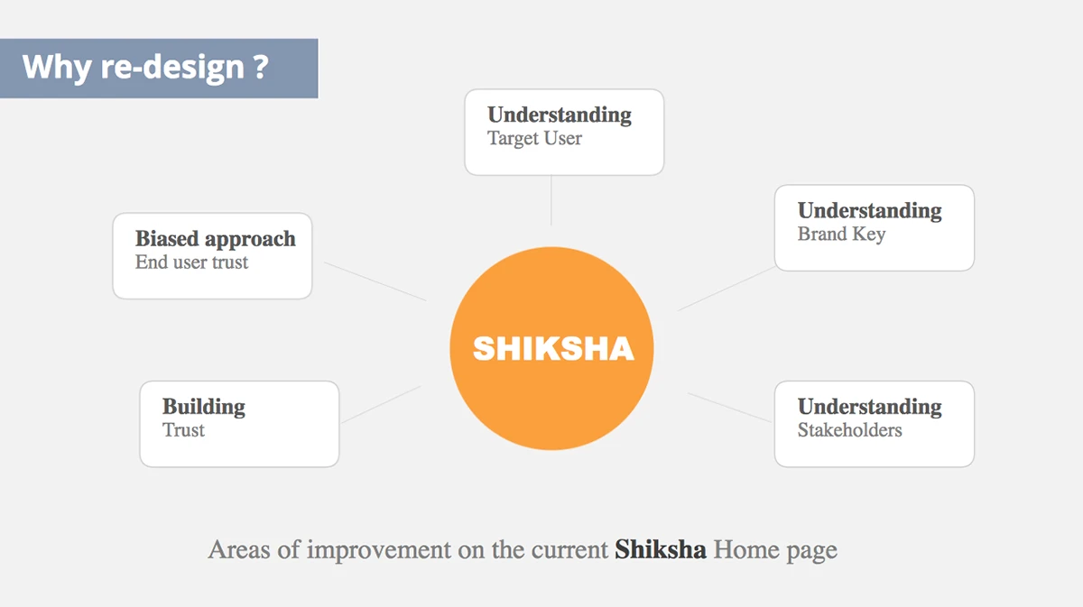
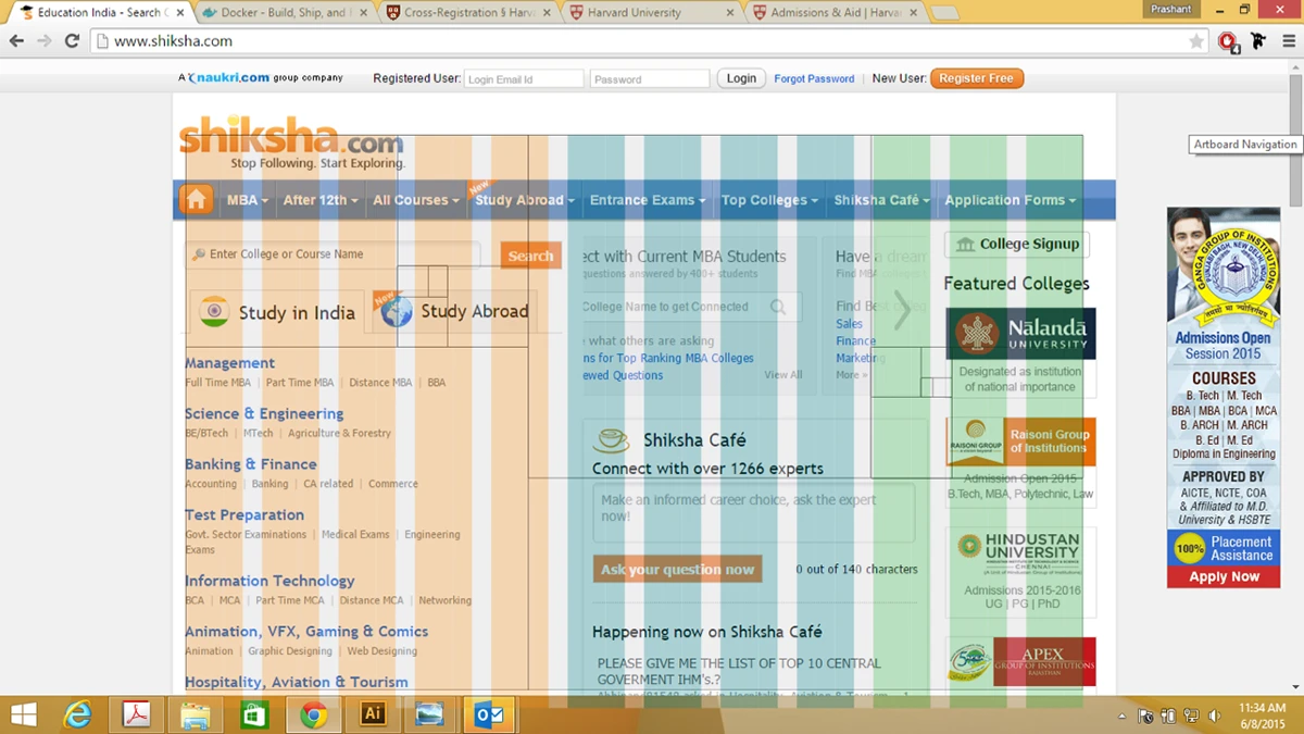
The homepage tried to serve everyone at once and helped no one decide. Students arrived to choose courses and colleges and met clutter instead of a path.
What changed
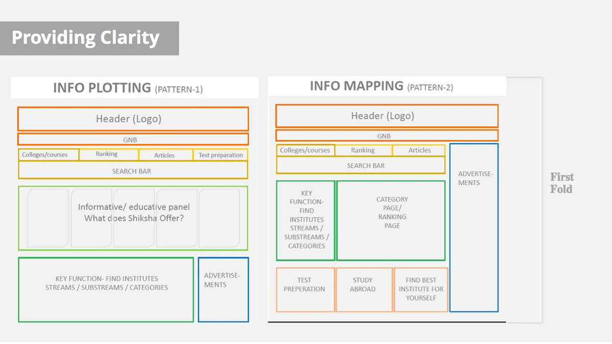
A homepage organised around real student intent — clearer entry points, a calmer hierarchy, and a layout the brand could grow into.