Shiksha.com — Visual System
A shared visual language for one of India's largest education platforms — so every team could ship in one voice.
Role
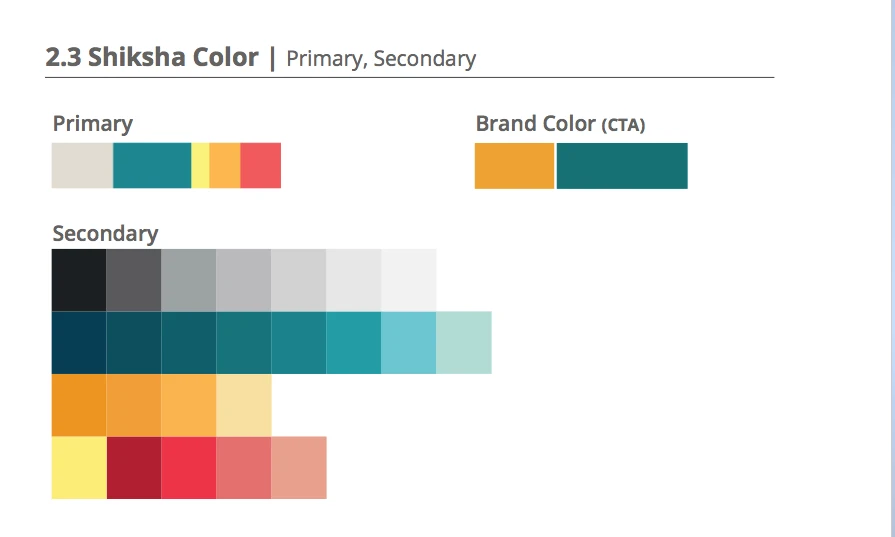
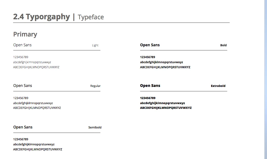
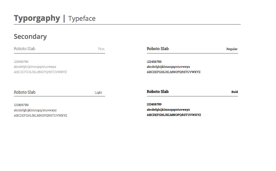
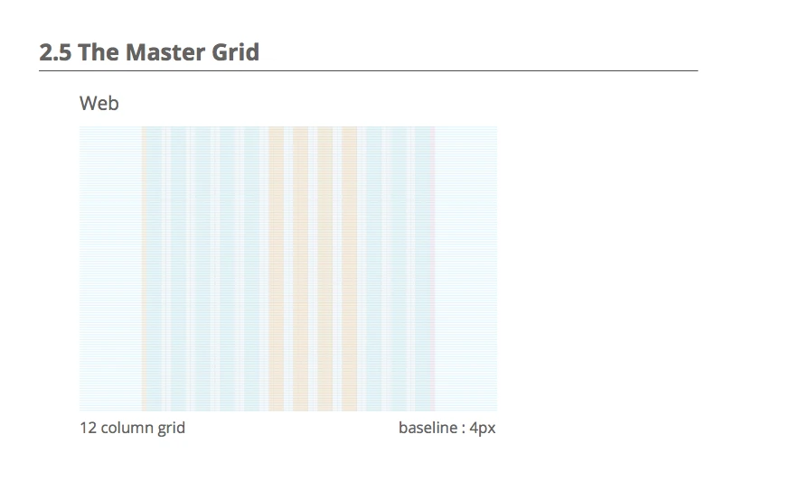
I owned the brand and visual guidelines across Shiksha's touchpoints — type, colour, grids, components, and the rules that hold them together.
Challenge
Shiksha spanned web, app, and marketing, with several squads designing in parallel. Screens drifted apart; the brand read differently depending on where you landed.
What changed
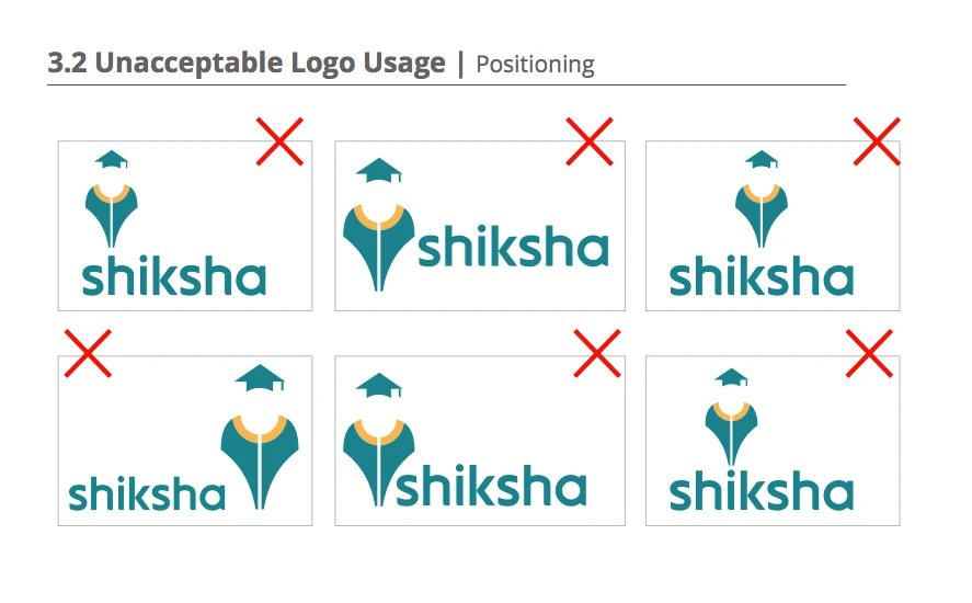
One documented system — type scale, colour, spacing, components, and usage rules. Teams stopped re-deciding the basics and shipped faster, in a single coherent voice.